• Skip to primary navigation
  • Skip to main content
Velocity Ascent

Velocity Ascent

Looking toward tomorrow today

  • Research
  • Design
  • Development
  • Strategy
  • About
    • Home
    • Contact Us
    • Services
  • Show Search
Hide Search

velocityascent

Master the Script: How Teleprompting Transforms Leadership Communication

velocityascent · April 29, 2024 ·

Deliver impactful presentations with confidence and precision – experienced Teleprompter Operators make it possible.

Navigating the ever-changing environment of business presentations requires not only mastering the art of effective communication but a knowledge of the latest presentation platforms.

An experienced teleprompter operator can be a vital ally who possesses in-depth knowledge of modern teleprompter systems and equipment, ensuring seamless setup and operation during presentations. Whether addressing shareholders, presenting at conferences, or engaging with the media, leaders need to convey their message confidently and convincingly – without falling victim to tech issues..

What is Teleprompting?

Teleprompting is a technique used to deliver speeches or presentations effectively by displaying text on a screen in front of the presenter, allowing them to read the script while maintaining eye contact with the audience. It’s commonly seen in various settings, including news broadcasts, political speeches, corporate presentations, and live events.

Teleprompter schematic representation: (1) Video camera; (2) Shroud; (3) Video monitor; (4) Clear glass or beam splitter; (5) Image from subject; (6) Image from video monitor

For C-suite leaders, startup founders, and corporate officers, teleprompting can be essential for several reasons:

  1. Maintaining Professionalism: Executives need to deliver polished presentations or speeches that reflect positively on their organization. Teleprompting ensures that they deliver their message smoothly and confidently, without stumbling over their words or losing their place in the script.
  2. Saving Time: Executives have busy schedules, and preparing for speeches or presentations can be time-consuming. Teleprompting allows them to focus on other aspects of their work while ensuring that they can deliver their message effectively when the time comes to present.
  3. Enhancing Delivery: Reading from a teleprompter can help executives maintain a steady pace and tone, ensuring that their message is conveyed clearly and convincingly to the audience.
  4. Reducing Anxiety: Public speaking can be nerve-wracking, even for experienced professionals. Teleprompting provides a sense of security, as executives can rely on the script to guide them through their presentation, reducing anxiety and allowing them to focus on engaging with the audience.


Teleprompting supports executives in delivering polished presentations that reflect positively on their organization, saving time, enhancing delivery by maintaining pace and tone, and reducing anxiety by providing security and guiding them through presentations.

There are several types of teleprompting systems available, ranging from traditional hardware-based setups to more modern software-based solutions:

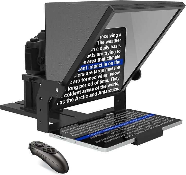
Hardware Teleprompters: These systems consist of a transparent glass or acrylic screen mounted in front of the camera lens, onto which the text is reflected from a monitor located below the camera. A Teleprompter Operator will scroll the text the speaker can read while maintaining eye contact with the audience through the camera lens.

Software Teleprompters: With the advancement of technology, software-based teleprompting solutions have become increasingly popular. These applications run on computers, tablets, or smartphones and display the text on the screen for the speaker to read. Software teleprompters often offer additional features such as adjustable scrolling speed, font customization, and remote control capabilities.

This can be particularly useful for speakers who need to make last-minute changes to their scripts. Software teleprompters may be more comfortable for tech-savy presenters who want total control over their presentation and can trouble-shoot any issues themselves without the use of a Teleprompter Operator.

AI has also started to make inroads into the field of teleprompting:

  1. AI-Assisted Teleprompting: Some teleprompting software now incorporates AI algorithms to improve the user experience. For example, AI can analyze the speaker’s speech patterns and adjust the scrolling speed of the text to match their natural pace, ensuring a smoother delivery. This form of presentation is in its early stage and will improve over time.
  2. Speech Recognition: AI-powered speech recognition technology can automatically generate scripts from spoken words, the final script can be displayed on the teleprompter screen.

Overall, teleprompting plays a crucial role in helping C-suite leaders, startup founders, and corporate officers deliver compelling presentations and speeches, and with the integration of AI technology, it continues to evolve to meet the future needs of modern communicators.

“Effective communication serves as the cornerstone of success, and Teleprompter Operators play a crucial role in ensuring that message delivery remains clear, concise, and impactful.”

A Teleprompter Operator is a skilled professional responsible for operating and managing teleprompter systems during presentations, speeches, or recordings. Their primary role is to ensure the smooth and efficient operation of the teleprompter, including setting up the equipment, loading and formatting scripts, adjusting settings to suit the presenter’s preferences, and operating the system during the presentation.

Teleprompter Operators may also provide support during rehearsals, offering feedback and guidance to presenters to improve their delivery. Additionally, they may assist with troubleshooting technical issues that may arise during the presentation, ensuring a seamless and uninterrupted flow of communication. Overall, Teleprompter Operators play a crucial role in facilitating effective communication by enabling presenters to deliver their messages confidently and smoothly.

Using a Teleprompter Operator offers many benefits that enhance the quality and impact of a presentation. First, they bring technical expertise, ensuring that the teleprompter system operates smoothly and efficiently, allowing the presenter to focus solely on delivering the message with confidence. Second, Teleprompter Operators offer valuable support during pre-presentation preparation, providing feedback and guidance to improve delivery. Their presence also alleviates the burden of managing the teleprompter system, allowing presenters to stay fully engaged with your audience without worrying about technical issues.

Ultimately, by leveraging the services of a Teleprompter Operator, you can elevate the professionalism and effectiveness of your presentation, leaving a lasting impression on your audience.

Graphic Design: Human handwork in a digital age.

velocityascent · April 24, 2024 ·

Discover the essence of handmade artistry merged seamlessly with digital design in the creative realm of Glenn Wolk.

With a penchant for infusing the raw charm of watercolors with the precision of digital techniques, the graphic designer Glenn Wolk has cultivated a distinctive artistic flair coveted by renowned brands such as Ralph Lauren, Tommy Hilfiger, and New Balance.

Glenn’s portfolio extends beyond fashion, encompassing collaborations with musical icons like Elton John, The Rolling Stones, Eminem, and Lady Gaga, where his designs grace posters and merchandise, embodying the essence of each artist’s persona.

Graphic Designer Glenn Wolk’s recent master class at Domestika.

Recently Wolk’s innovative process caught the eye of the team at Domestika who thought he would be an ideal candidate to teach a Master Class on his process in designing creations. The class covers the process from initial concept sketching to meticulous digital refinement, resulting in a harmonious fusion of traditional and contemporary methodologies.

Based in Brooklyn, New York graphic designer, Glenn Wolk, creates stunning one of a kind art for fashion, entertainment and print media. He designs graphics and paintings for The Rolling Stones, Eminem, and The Beatles, among other iconic singers and bands. Glenn also supports the causes he belives in by creating work for nonprofits making a difference in the community.

In the slide show above, step into the vibrant world of Glenn Wolk’s graphic designs, where fashion, entertainment, and traditional arts converge to create visually stunning narratives that captivate the imagination. Observing Wolk’s hand work, it’s impossible not to be drawn into the dynamic interplay of color, form, and style that defines his signature aesthetic.

Promotional Domestika video collaboration produced with Velocity Ascent.

New York City has always been Glenn’s natural habitat and the energy, grit and creativity star frequently in his creations. From the glossy pages of high-fashion magazines to the electrifying posters adorning the city’s streets, Wolk’s designs command attention and spark conversation. In the video above, we have the opportunity to tag along with Glenn as he walks through neighborhoods of inspiration. In the realm of fashion, entertainment, and media, Glenn Wolk stands as a visionary artist, shaping trends and leaving an indelible mark on both the visual and cultural landscape.

Glenn Wolk is an example of the diverse group of individuals in the VA Network who bring a bespoke skill sets to the team at large. Glenn’s ability to create a unique visual experience is second to none.

Streamlining Startup Operations: Best Practices for Efficiency and Growth

velocityascent · April 19, 2024 ·

From Chaos to Cohesion: Transforming Your Startup’s Day-to-Day Operations for Success

As startups journey through the tumultuous waters of entrepreneurship, they often face a common challenge: the lack of standardized business practices. From disjointed communication channels to scattered team coordination, the chaos of day-to-day operations can hinder productivity and impede growth, even in late-stage startups. But fear not! By implementing best practices and embracing streamlined workflows, startups can shed the weaknesses of disorganization and forge a path toward efficiency and success.

Embrace Unified Communication Channels

“In a world of fragmented communication, unity is strength. Embrace unified channels to streamline communication and foster collaboration.”

One of the first steps toward streamlining startup operations is to establish unified communication channels. Whether it’s through email, instant messaging platforms, or project management tools, having a centralized hub for communication ensures that team members are on the same page and information flows seamlessly across the organization. By consolidating communication channels, startups can reduce the risk of miscommunication, enhance team collaboration, and accelerate decision-making processes.

Cultivate a Centralized Point of Contact

“In the midst of chaos, clarity is key. Cultivate a centralized point of contact to serve as the anchor for your startup’s day-to-day operations.”

In the fast-paced world of startups, having a central go-to person for all team members is essential for maintaining order and coherence. Whether it’s a dedicated project manager, operations lead, or office manager, having a centralized point of contact ensures that questions are answered promptly, issues are addressed effectively, and tasks are coordinated efficiently. This individual serves as the linchpin of the organization, keeping operations running smoothly and fostering a culture of accountability and responsibility.

Implement Standardized Processes and Workflows

“Consistency breeds efficiency. Implement standardized processes and workflows to streamline operations and drive sustainable growth.”

To overcome the challenges of disorganization, startups must establish standardized processes and workflows across key areas of operation, including project management, customer support, and financial management. By defining clear guidelines, automating repetitive tasks, and leveraging technology solutions, startups can minimize errors, optimize resource allocation, and improve overall efficiency. From onboarding new employees to managing customer inquiries, standardized processes ensure consistency and reliability, enabling startups to scale with confidence.

“Innovation is the catalyst for transformation. Leverage technology solutions to automate tasks and integrate systems, freeing up time for strategic initiatives.”

In the digital age, technology is a powerful ally in the quest for operational excellence. Startups can leverage a myriad of software solutions and tools to automate repetitive tasks, streamline workflows, and integrate systems seamlessly. Whether it’s project management software, CRM platforms, or collaboration tools, technology solutions empower startups to work smarter, not harder. By embracing automation and integration, startups can optimize efficiency, enhance agility, and unlock new opportunities for growth.

The effectiveness of an office environment in fostering innovation depends on how well it aligns with the specific needs and working styles of the individuals and teams within the organization.

Foster a Culture of Continuous Improvement

“Innovation is not a destination but a journey. Foster a culture of continuous improvement to adapt, evolve, and thrive in an ever-changing landscape.”

Last but not least, startups must embrace a mindset of continuous improvement to stay ahead of the curve. By soliciting feedback from team members, analyzing performance metrics, and iterating on processes, startups can identify areas for optimization and drive ongoing improvement. This culture of continuous learning and adaptation ensures that startups remain agile, resilient, and responsive to the evolving needs of their customers and the market.

Paving the Path to Operational Excellence

“In the face of chaos, there is opportunity. By embracing best practices and streamlining day-to-day operations, startups can shed the weaknesses of disorganization and pave the path to operational excellence.”

In the fast-paced world of startups, operational excellence is the cornerstone of success – unified communication channels, centralized points of contact, standardized processes, leveraging technology, and fostering a culture of continuous improvement, startups can overcome the challenges of disorganization and propel themselves toward efficiency, growth, and success.

Data Visualization for Business Professionals

velocityascent · March 12, 2024 ·

If all graphs are a type of chart, and all charts are not graphs – what are diagrams?

Graphs, charts, and diagrams serve as powerful tools that offer clarity, enhance communication, and drive informed decision-making. By transforming complex datasets and ideas into visually compelling representations, business professionals gain insights, spot trends, and collaborate more effectively. From facilitating understanding to identifying opportunities and risks, data visualization plays a vital role in empowering organizations to thrive in a competitive environment.

Charts, encompassing bar charts, pie charts, and scatter plots, among others, excel in presenting data comparisons, distributions, and compositions, respectively. They offer a concise snapshot of information, making them ideal for conveying trends and relationships in a straightforward manner. Graphs, including line graphs, area graphs, and histograms, specialize in showcasing data trends and distributions

Charles Minard’s 1869 Sankey chart showing the number of men in Napoleon’s 1812 Russian campaign army, their movements, as well as the temperature they encountered on the return path.

over time or across variables, aiding in trend analysis and pattern recognition. Diagrams, such as flowcharts, network diagrams, and organizational charts, are instrumental in illustrating processes, hierarchies, and relationships, facilitating understanding and decision-making in complex systems.

Different types of graphs

The concept of graphs, as in graphical representations of data, has been around for centuries, with various scholars and scientists contributing to its development over time. One notable figure in the history of graphs is William Playfair, a Scottish engineer and economist, who is often credited with inventing several types of graphs in the late 18th century. Playfair created the line graph, bar chart, and pie chart, which are fundamental components of modern data visualization.

Playfair’s trade-balance time-series chart, published in his Commercial and Political Atlas, 1786

However, it’s important to note that graphical representations of data have been used in different forms throughout history by different civilizations for various purposes, such as illustrating statistical information, depicting geographical features, and conveying mathematical concepts. So, while Playfair made significant contributions to the development of modern graphs, the origins of graphical representations of data can be traced back much further.

Line Graphs: Utilized to illustrate fluctuating data trends over specified timeframes, such as temperature variations across different dates, line graphs provide a succinct depiction of relational data dynamics.

Bar Graphs: With their simple yet impactful presentation, bar graphs facilitate easy comparison of numerical values, making them indispensable for analyzing inventories, group sizes, and financial forecasts. Widely employed by marketing firms, they effectively showcase ratings and survey responses.

Pictographs: Employing images or symbols in lieu of bars, pictographs offer a visually engaging means of representing data, ideal for conveying information in formats like infographics. For instance, depicting book sales over several months using book icons adds an intuitive dimension to the data.

Histograms: Ideal for illustrating the distribution of numeric data across categories, histograms provide valuable insights into statistical patterns. Whether portraying age demographics within a population or other categorical distributions, histograms offer a comprehensive overview of data distribution.

Area Graphs: Capturing changes in one or multiple quantities over time, area graphs are instrumental in identifying trends and patterns. By incorporating color-coded segments, they elucidate how diverse quantities contribute to an overarching trend, aiding businesses in strategic decision-making processes.

Scatter Plots: Offering a visual representation of the relationship between two variables, scatter plots provide invaluable insights into correlations. Whether analyzing the connection between height and weight or other paired variables, scatter plots reveal patterns that inform data-driven strategies.

Different types of charts

In today’s data-driven world, the ability to effectively communicate complex information is key. Charts serve as powerful tools for transforming raw data into actionable insights, providing clarity and context in a visually appealing manner. Pioneers John von Neumann, Herman H. Goldstine, and Arthur W. Burks laid the groundwork for electronic computing back in 1947 with their seminal work, “Preliminary Discussion of the Logical Design of an Electronic Computing Instrument.” They created the first computer flow charts to simplify and streamline the understanding of intricate data sets.

1947 – John Von Neumann created the first theoretical discussion of programming through use of ‘flow diagram’ (which eventually became flow chart and finally, flowchart) as a logically complete and precise notation for expressing a mathematical problem, and eventually formed the basis for all computer programming.

From bar graphs to scatter plots, these visual aids have become indispensable assets in the modern business landscape, facilitating informed decision-making and driving success.

Flowcharts: Essential for mapping out processes from inception to conclusion, flowcharts elucidate decision points and possible pathways within complex workflows. A flowchart can also be considered as a diagram that represents a process or workflow through a series of shapes connected by arrows. It is widely used in business, engineering, and computer programming to illustrate the steps involved in completing a task or achieving a goal. Flowcharts typically start with a starting point (usually represented by an oval), followed by various actions or decisions represented by rectangles or diamonds, and ending with an outcome or final step. They provide a visual roadmap for understanding the sequence of actions and decision points within a process.

Pie Charts: Efficiently conveying proportions within a whole, pie charts are instrumental in visualizing segments of data. Whether delineating demographic segments or budget allocations, pie charts offer a succinct overview in business presentations. A pie chart is typically a circular statistical graphic divided into slices to illustrate numerical proportions. Each slice represents a proportionate part of the whole, with the size of each slice corresponding to the relative magnitude of the data it represents. They provide a quick and intuitive way to understand how different components contribute to a total or overall value.

Gantt Charts: Invaluable for project management, Gantt charts delineate project schedules, providing a comprehensive overview of tasks and timelines. By visually tracking progress and milestones, they ensure seamless project execution.

Waterfall Charts: Designed to showcase variances over time, waterfall charts elucidate the impact of successive changes on an initial value. Whether analyzing financial statements or profit and loss trends, they provide a nuanced understanding of evolving data sets.

Gauge Charts: Offering a visual representation akin to a dial, gauge charts pinpoint specific data points within predefined ranges. From illustrating performance metrics to tracking revenue goals, gauge charts provide at-a-glance insights into key business parameters.

Funnel Charts: With their distinctive shape, funnel charts illustrate the progression of values through sequential stages. Whether tracking sales pipelines or website traffic, funnel charts offer a dynamic portrayal of evolving data trends.

Bullet Charts: Tailored to measure performance against predefined targets, bullet charts are invaluable for assessing progress towards key objectives. Whether tracking profits or expenses, they provide a comprehensive overview of key performance indicators (KPIs) within a single visual framework.

Four-Quadrant Chart: A Four-Quadrant Chart, also known as a Quadrant Analysis or a Cartesian Chart, is a graphical tool used to categorize data into four quadrants based on two independent variables. The chart typically has two axes (horizontal and vertical) representing these variables. Each axis divides the chart into two halves, creating four quadrants. The data points are plotted on the chart based on their values for the two variables, with each quadrant representing a different combination of high and low values for the variables. Four-Quadrant Charts are commonly used in business, management, and decision-making to analyze and prioritize strategies, projects, or products based on criteria such as profitability, market growth, risk, or performance.

Business Matrix: A Business Matrix, also known as a Decision Matrix or Grid Analysis, is a structured decision-making tool used to evaluate and prioritize alternatives based on multiple criteria or factors. It consists of a matrix with criteria listed along the rows and alternatives listed along the columns. Each cell in the matrix represents the intersection of a criterion and an alternative, where scores or ratings are assigned to evaluate the performance of each alternative against each criterion. Business Matrices help in systematically comparing and selecting the best option among competing alternatives, considering various factors such as cost, quality, time, and feasibility. They are widely used in project management, product development, supplier selection, and strategic planning to support decision-making processes and enhance transparency in evaluations.

What is the difference between The Four-Quadrant Chart and a Business Matrix?

The Four-Quadrant Chart and a Business Matrix are both tools that use matrices and can aid decision-making, they have distinct applications and structures. The Four-Quadrant Chart focuses on visualizing relationships between variables, while the Business Matrix is geared towards evaluating and prioritizing alternatives based on predefined criteria.

The Four-Quadrant Chart is primarily used to categorize data into four quadrants based on two independent variables. It helps visualize relationships between variables and identify patterns or trends within the data. This type of chart is often used in business to analyze strategies, products, or projects based on criteria like risk and reward, cost and benefit, or effort and impact.

On the other hand, the Business Matrix, also known as a Decision Matrix or Grid Analysis, is a tool used to evaluate and prioritize alternatives based on multiple criteria or factors. It involves creating a matrix where alternatives are listed in rows and criteria are listed in columns. Scores or ratings are then assigned to each alternative based on its performance against each criterion. The Business Matrix facilitates systematic comparison and selection of the best option among competing alternatives, considering various factors such as cost, quality, and feasibility.

Let’s look at two real-world examples of the Four-Quadrant Chart and the Business Matrix.

Four-Quadrant Chart Example: Imagine a software development company evaluating its various projects based on their potential profitability and technical complexity.

They could use a Four-Quadrant Chart to plot each project based on these two factors. Projects with high potential profitability and low technical complexity would be placed in one quadrant, representing low-risk, high-reward opportunities. Conversely, projects with low profitability and high technical complexity would fall into another quadrant, indicating high-risk, low-reward endeavors. This visualization helps the company prioritize projects based on their alignment with strategic objectives and resource allocation.

  • Strengths:
    • Visual representation: Provides a clear and intuitive visual representation of relationships between two variables.
    • Simple interpretation: Easy to understand and interpret, making it suitable for communicating key insights to stakeholders.
    • Quick analysis: Allows for quick identification of patterns or trends within the data.
  • Limitations:
    • Limited to two variables: Can only analyze relationships between two variables, which may not capture the full complexity of some situations.
    • Subjectivity: Placement of data points within quadrants may be subjective, depending on how criteria are defined and measured.

Business Matrix Example: Consider a manufacturing company seeking to select a supplier for a critical component. They could create a Business Matrix to evaluate several potential suppliers based on criteria such as quality, cost, reliability, and location. Each supplier would be assessed and scored against these criteria, with ratings ranging from poor to excellent. By comparing the scores for each supplier across all criteria, the company can identify the most suitable option. For instance, a supplier may excel in quality but have higher costs, while another may offer lower costs but with less reliability. The Business Matrix allows the company to make an informed decision based on a comprehensive evaluation of each supplier’s strengths and weaknesses.

  • Strengths:
    • Comprehensive evaluation: Allows for a comprehensive evaluation of alternatives based on multiple criteria or factors.
    • Structured decision-making: Provides a structured framework for comparing and prioritizing alternatives objectively.
    • Flexibility: Can accommodate a wide range of criteria and alternatives, making it suitable for complex decision-making scenarios.
  • Limitations:
    • Data collection: Requires detailed data collection and scoring for each criterion, which can be time-consuming and resource-intensive.
    • Complexity: The matrix structure may become unwieldy with a large number of alternatives or criteria, leading to potential information overload.
    • Subjectivity: Scoring criteria and assigning weights to criteria may involve subjective judgment, potentially leading to bias.

The choice between a Four-Quadrant Chart and a Business Matrix depends on factors such as the complexity of the decision-making task, the number of variables or criteria involved, and the preference for visual representation versus structured evaluation. Both tools have their strengths and limitations, and selecting the most appropriate one requires careful consideration of the specific requirements and objectives of the analysis.

Chord diagrams are commonly used to represent pairwise relationships, such as trade flows between countries, connections between nodes in a social network, or co-occurrences of items in a dataset.

Different types of diagrams

Diagrams are visual representations used to convey information, concepts, relationships, or processes in a structured and easily understandable manner. They come in various forms, each tailored to suit specific purposes and audiences.

Venn Diagram: Venn diagrams are used to show the relationships between different sets of items. They consist of overlapping circles, each representing a set, with the overlapping areas indicating items that belong to multiple sets. Venn diagrams are commonly used in mathematics, logic, statistics, and problem-solving scenarios to visualize the intersections and differences between various groups or categories. They help in analyzing similarities and differences between different elements or concepts.

Network Diagram: Network diagrams, also known as graph diagrams, illustrate the connections and relationships between various nodes or elements within a network. They are commonly used in computer science, telecommunications, project management, and systems engineering to depict the interactions between interconnected components. Network diagrams consist of nodes (representing entities or objects) and edges (representing the connections or relationships between them). These diagrams help in visualizing complex systems, identifying dependencies, and understanding the flow of information or resources within a network.

Alluvial Diagram: An Alluvial diagram is a type of flow diagram that represents changes over time or between different categories. It is particularly useful for visualizing the flow and relationships between multiple categorical variables across different stages or time periods. Alluvial diagrams use interconnected streams to show the transitions of items between categories. They are commonly used in data visualization to analyze complex datasets, such as migration patterns, product flows, or categorical data with multiple dimensions.

Example of a Sankey diagram used for hiring.

Sankey Diagram: A Sankey diagram is a type of flow diagram that visualizes the flow of energy, resources, or quantities through a system. It consists of nodes representing the sources and destinations of flows, connected by directed links representing the flow paths and their magnitudes. Sankey diagrams are effective in illustrating the distribution, transformation, and efficiency of resources or processes. They are widely used in engineering, environmental science, and business to analyze energy flows, material balances, and resource allocations.

Chord Diagram: A Chord diagram is a circular graphical method used to visualize the relationships and connections between entities within a network or dataset. It consists of arcs that connect points around the circumference of a circle, with the width of each arc proportional to the strength or frequency of the connection between the corresponding entities. Chord diagrams are commonly used to represent pairwise relationships, such as trade flows between countries, connections between nodes in a social network, or co-occurrences of items in a dataset. They provide a concise and intuitive way to explore complex networks and identify patterns of interaction.

Defect Concentration Diagram: A Defect Concentration diagram, also known as a Pareto chart, is a specialized type of bar chart used to prioritize and visualize the frequency or impact of different types of defects, problems, or causes within a system or process. It consists of bars arranged in descending order of frequency or severity, with the cumulative percentage of occurrences represented by a line graph. Defect Concentration diagrams help in identifying the most significant contributors to overall issues or problems, allowing organizations to focus their efforts on addressing the most critical areas for improvement. They are commonly used in quality management, process improvement, and problem-solving methodologies such as Six Sigma.

Mind Map: A mind map is a hierarchical diagram used to visually organize information around a central concept or theme. It consists of a central idea or topic branching out into subtopics or related concepts, which further branch into more detailed or specific information. Mind maps are often used in brainstorming, note-taking, problem-solving, and decision-making processes to capture ideas, explore relationships, and stimulate creative thinking. They provide a structured yet flexible framework for organizing thoughts and concepts in a non-linear fashion.

Flowchart: Although a flowchart is typically referred to as a chart it can also be defined as a diagram representing a process or workflow.

The importance of Data Visualization for Business Professionals

In the contemporary data-driven landscape, where vast amounts of information are generated daily, data visualization plays a pivotal role in simplifying complexity.

Through visually engaging formats like graphs, charts, and diagrams, professionals can effectively convey intricate concepts, discern trends, identify anomalies, and unveil patterns within datasets. These visual representations not only aid comprehension but also expedite and enhance the accuracy of decision-making processes. Additionally, data visualization fosters collaboration among teams by providing a shared language through which stakeholders can interpret and analyze data, thus promoting alignment and consensus.

Effective visual communications start with a plan.

Building an effective chart or graph begins with a clear understanding of the data to be visualized and the intended message to convey.

Our process typically involves several key steps, starting with data collection and organization. Once the data is gathered, it’s essential to select the most appropriate type of chart or graph that aligns with the nature of the data and the insights sought. This decision considers factors such as the relationships between variables, the temporal aspects of the data, audience’s preferences and ease of use by the viewer. Next, the chosen chart or graph is designed and constructed with the goal of ensuring clarity, accuracy, and visual appeal. Labels, titles, and axis descriptions are added to provide context and aid interpretation. Throughout the process, attention to detail is key to ensuring the accuracy and integrity of the visual representation. Finally, the completed chart or graph is reviewed by the team and refined as necessary to optimize its effectiveness in communicating the desired information clearly and concisely to stakeholders or decision-makers.

Digital Mapping: Where are we going?

velocityascent · February 20, 2024 ·

Enterprise, Open-Source, and Nonprofit Initiatives

Digital mapping refers to the process of creating, manipulating, analyzing, and visualizing geographic data using digital technology. It involves the use of specialized software and tools to represent spatial information accurately and effectively.

Geospatial technology allows individuals and organizations to create maps, analyze spatial relationships, and make informed decisions based on geographic data. It encompasses various techniques such as satellite imagery, GPS data, and geographic information systems (GIS) to accurately depict and understand the physical world in a digital format.

A brief history of digital mapping

Historically, mapping has been a fundamental human endeavor, dating back thousands of years. Early civilizations created maps to navigate their surroundings, record land ownership, plan settlements, and depict geographic features. These early maps were often hand-drawn on materials such as parchment, clay tablets, or paper.

The David Rumsey Historical Map Collection

The evolution of digital mapping can be traced back to the invention of technologies such as the compass, sextant, and telescope, which enabled more accurate measurements of geographic locations and shapes. The development of printing presses in the 15th century allowed for the mass production of maps, making them more accessible to a wider audience.

The advent of computers in the 20th century revolutionized the field of cartography, leading to the creation of digital mapping systems and Geographic Information Systems (GIS). Early computerized mapping systems were developed for specialized applications such as military planning and urban planning.

NOAA Satellite “Edmund Fitzgerald Storm” 11/11/1975

Over time, advancements in computer technology, satellite imagery, remote sensing, and data processing capabilities have fueled the rapid growth and sophistication of digital mapping.

Current Applications in use

Today, digital mapping encompasses a wide range of technologies and applications, from web-based mapping services to complex GIS software used for spatial analysis and decision-making in various industries.

Enterprise Solutions: Leading the charge in the enterprise realm is Esri, renowned for its comprehensive Geographic Information System (GIS) software suite. Esri’s ArcGIS Online platform empowers businesses with powerful mapping capabilities, spatial analytics, and data visualization tools. Alongside Esri, Mapbox offers enterprise-grade mapping solutions, providing customizable maps, geocoding services, and navigation APIs tailored for businesses. Additionally, Google Maps Platform stands out with its vast array of mapping tools, including Maps JavaScript API, Geocoding API, and Places API, catering to diverse enterprise needs.

Open-Source Solutions: In the realm of open-source online mapping, OpenStreetMap (OSM) reigns supreme as a collaborative mapping project powered by a global community. OSM provides free, editable maps and geospatial data that can be utilized for various applications. Leaflet emerges as a popular open-source JavaScript library for interactive maps, offering simplicity, flexibility, and compatibility across different platforms. Another noteworthy solution is GeoServer, an open-source server-side software for sharing and editing geospatial data, ideal for building dynamic mapping applications.

Nonprofit Mapping Initiatives: Nonprofit organizations also play a crucial role in advancing online mapping initiatives. The Humanitarian OpenStreetMap Team (HOT) stands at the forefront, leveraging volunteer contributions to map vulnerable areas and support disaster response efforts worldwide. Ushahidi, a nonprofit tech company, offers an open-source platform for crowdsourced mapping and data collection, enabling communities to share critical information during crises. Moreover, Global Forest Watch (GFW) provides an online platform for monitoring and analyzing global forest landscapes, empowering conservation efforts through data-driven insights.

Native OS Mobile Apps

In addition to web applications, several native OS apps enrich the online mapping landscape:

  • Esri ArcGIS Explorer: A native app available for iOS and Android devices, offering mobile access to GIS data, maps, and tools for field data collection and visualization.
  • Google Earth Pro: A desktop application providing advanced mapping features, 3D visualization, and historical imagery for spatial analysis and exploration.
  • QGIS (Quantum GIS): An open-source desktop GIS application supporting multiple platforms, allowing users to create, edit, visualize, and analyze geospatial data.

Online mapping continues to redefine how we perceive and interact with spatial data through leveraging the power of GIS for audience insights, harnessing community-driven mapping projects, or supporting humanitarian efforts.

  • « Go to Previous Page
  • Page 1
  • Page 2
  • Page 3
  • Page 4
  • Go to Next Page »

Velocity Ascent

© 2025 Velocity Ascent · Privacy · Terms · YouTube · Log in