If all graphs are a type of chart, and all charts are not graphs – what are diagrams?
Graphs, charts, and diagrams serve as powerful tools that offer clarity, enhance communication, and drive informed decision-making. By transforming complex datasets and ideas into visually compelling representations, business professionals gain insights, spot trends, and collaborate more effectively. From facilitating understanding to identifying opportunities and risks, data visualization plays a vital role in empowering organizations to thrive in a competitive environment.
Charts, encompassing bar charts, pie charts, and scatter plots, among others, excel in presenting data comparisons, distributions, and compositions, respectively. They offer a concise snapshot of information, making them ideal for conveying trends and relationships in a straightforward manner. Graphs, including line graphs, area graphs, and histograms, specialize in showcasing data trends and distributions
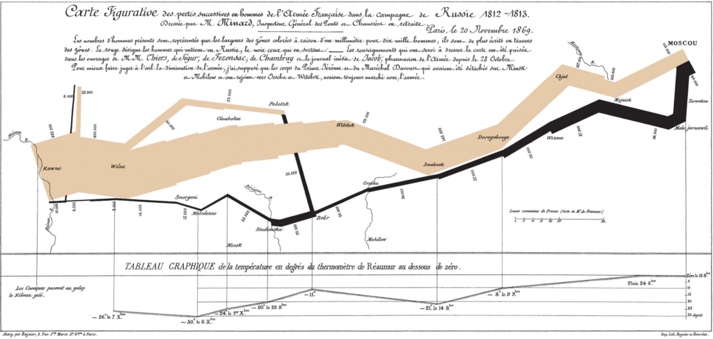
over time or across variables, aiding in trend analysis and pattern recognition. Diagrams, such as flowcharts, network diagrams, and organizational charts, are instrumental in illustrating processes, hierarchies, and relationships, facilitating understanding and decision-making in complex systems.
Different types of graphs
The concept of graphs, as in graphical representations of data, has been around for centuries, with various scholars and scientists contributing to its development over time. One notable figure in the history of graphs is William Playfair, a Scottish engineer and economist, who is often credited with inventing several types of graphs in the late 18th century. Playfair created the line graph, bar chart, and pie chart, which are fundamental components of modern data visualization.
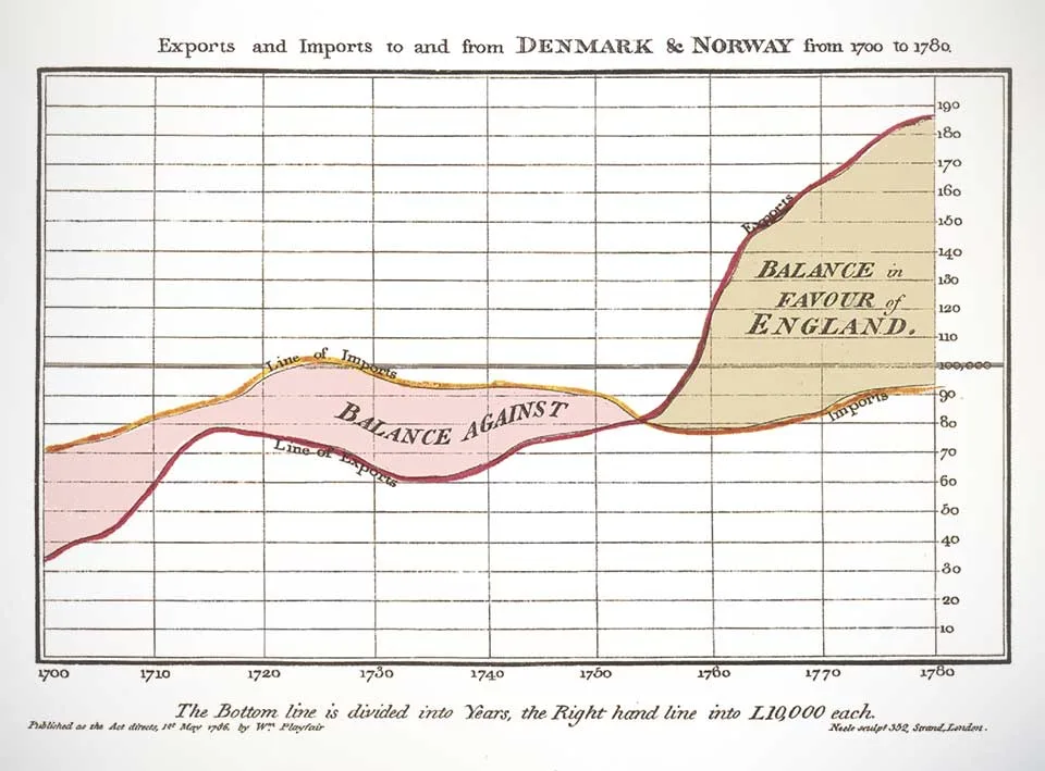
However, it’s important to note that graphical representations of data have been used in different forms throughout history by different civilizations for various purposes, such as illustrating statistical information, depicting geographical features, and conveying mathematical concepts. So, while Playfair made significant contributions to the development of modern graphs, the origins of graphical representations of data can be traced back much further.
Line Graphs: Utilized to illustrate fluctuating data trends over specified timeframes, such as temperature variations across different dates, line graphs provide a succinct depiction of relational data dynamics.
Bar Graphs: With their simple yet impactful presentation, bar graphs facilitate easy comparison of numerical values, making them indispensable for analyzing inventories, group sizes, and financial forecasts. Widely employed by marketing firms, they effectively showcase ratings and survey responses.
Pictographs: Employing images or symbols in lieu of bars, pictographs offer a visually engaging means of representing data, ideal for conveying information in formats like infographics. For instance, depicting book sales over several months using book icons adds an intuitive dimension to the data.
Histograms: Ideal for illustrating the distribution of numeric data across categories, histograms provide valuable insights into statistical patterns. Whether portraying age demographics within a population or other categorical distributions, histograms offer a comprehensive overview of data distribution.
Area Graphs: Capturing changes in one or multiple quantities over time, area graphs are instrumental in identifying trends and patterns. By incorporating color-coded segments, they elucidate how diverse quantities contribute to an overarching trend, aiding businesses in strategic decision-making processes.
Scatter Plots: Offering a visual representation of the relationship between two variables, scatter plots provide invaluable insights into correlations. Whether analyzing the connection between height and weight or other paired variables, scatter plots reveal patterns that inform data-driven strategies.
Different types of charts
In today’s data-driven world, the ability to effectively communicate complex information is key. Charts serve as powerful tools for transforming raw data into actionable insights, providing clarity and context in a visually appealing manner. Pioneers John von Neumann, Herman H. Goldstine, and Arthur W. Burks laid the groundwork for electronic computing back in 1947 with their seminal work, “Preliminary Discussion of the Logical Design of an Electronic Computing Instrument.” They created the first computer flow charts to simplify and streamline the understanding of intricate data sets.
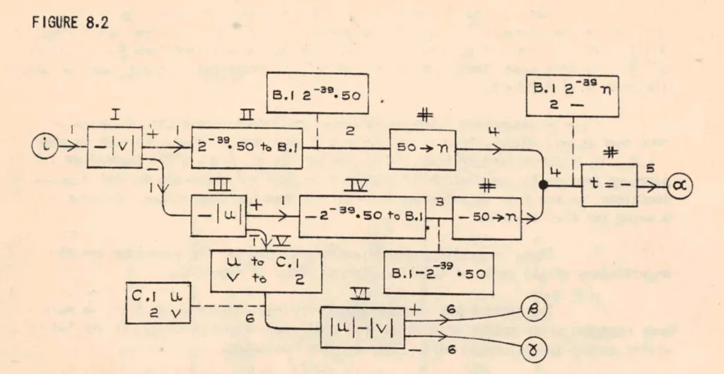
From bar graphs to scatter plots, these visual aids have become indispensable assets in the modern business landscape, facilitating informed decision-making and driving success.
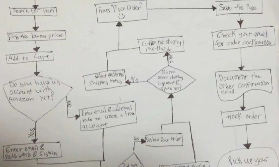
Flowcharts: Essential for mapping out processes from inception to conclusion, flowcharts elucidate decision points and possible pathways within complex workflows. A flowchart can also be considered as a diagram that represents a process or workflow through a series of shapes connected by arrows. It is widely used in business, engineering, and computer programming to illustrate the steps involved in completing a task or achieving a goal. Flowcharts typically start with a starting point (usually represented by an oval), followed by various actions or decisions represented by rectangles or diamonds, and ending with an outcome or final step. They provide a visual roadmap for understanding the sequence of actions and decision points within a process.
Pie Charts: Efficiently conveying proportions within a whole, pie charts are instrumental in visualizing segments of data. Whether delineating demographic segments or budget allocations, pie charts offer a succinct overview in business presentations. A pie chart is typically a circular statistical graphic divided into slices to illustrate numerical proportions. Each slice represents a proportionate part of the whole, with the size of each slice corresponding to the relative magnitude of the data it represents. They provide a quick and intuitive way to understand how different components contribute to a total or overall value.
Gantt Charts: Invaluable for project management, Gantt charts delineate project schedules, providing a comprehensive overview of tasks and timelines. By visually tracking progress and milestones, they ensure seamless project execution.
Waterfall Charts: Designed to showcase variances over time, waterfall charts elucidate the impact of successive changes on an initial value. Whether analyzing financial statements or profit and loss trends, they provide a nuanced understanding of evolving data sets.
Gauge Charts: Offering a visual representation akin to a dial, gauge charts pinpoint specific data points within predefined ranges. From illustrating performance metrics to tracking revenue goals, gauge charts provide at-a-glance insights into key business parameters.
Funnel Charts: With their distinctive shape, funnel charts illustrate the progression of values through sequential stages. Whether tracking sales pipelines or website traffic, funnel charts offer a dynamic portrayal of evolving data trends.
Bullet Charts: Tailored to measure performance against predefined targets, bullet charts are invaluable for assessing progress towards key objectives. Whether tracking profits or expenses, they provide a comprehensive overview of key performance indicators (KPIs) within a single visual framework.
Four-Quadrant Chart: A Four-Quadrant Chart, also known as a Quadrant Analysis or a Cartesian Chart, is a graphical tool used to categorize data into four quadrants based on two independent variables. The chart typically has two axes (horizontal and vertical) representing these variables. Each axis divides the chart into two halves, creating four quadrants. The data points are plotted on the chart based on their values for the two variables, with each quadrant representing a different combination of high and low values for the variables. Four-Quadrant Charts are commonly used in business, management, and decision-making to analyze and prioritize strategies, projects, or products based on criteria such as profitability, market growth, risk, or performance.
Business Matrix: A Business Matrix, also known as a Decision Matrix or Grid Analysis, is a structured decision-making tool used to evaluate and prioritize alternatives based on multiple criteria or factors. It consists of a matrix with criteria listed along the rows and alternatives listed along the columns. Each cell in the matrix represents the intersection of a criterion and an alternative, where scores or ratings are assigned to evaluate the performance of each alternative against each criterion. Business Matrices help in systematically comparing and selecting the best option among competing alternatives, considering various factors such as cost, quality, time, and feasibility. They are widely used in project management, product development, supplier selection, and strategic planning to support decision-making processes and enhance transparency in evaluations.
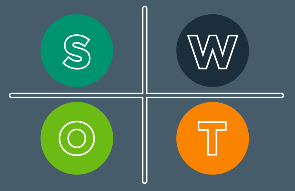
What is the difference between The Four-Quadrant Chart and a Business Matrix?
The Four-Quadrant Chart and a Business Matrix are both tools that use matrices and can aid decision-making, they have distinct applications and structures. The Four-Quadrant Chart focuses on visualizing relationships between variables, while the Business Matrix is geared towards evaluating and prioritizing alternatives based on predefined criteria.
The Four-Quadrant Chart is primarily used to categorize data into four quadrants based on two independent variables. It helps visualize relationships between variables and identify patterns or trends within the data. This type of chart is often used in business to analyze strategies, products, or projects based on criteria like risk and reward, cost and benefit, or effort and impact.
On the other hand, the Business Matrix, also known as a Decision Matrix or Grid Analysis, is a tool used to evaluate and prioritize alternatives based on multiple criteria or factors. It involves creating a matrix where alternatives are listed in rows and criteria are listed in columns. Scores or ratings are then assigned to each alternative based on its performance against each criterion. The Business Matrix facilitates systematic comparison and selection of the best option among competing alternatives, considering various factors such as cost, quality, and feasibility.
Let’s look at two real-world examples of the Four-Quadrant Chart and the Business Matrix.
Four-Quadrant Chart Example: Imagine a software development company evaluating its various projects based on their potential profitability and technical complexity.
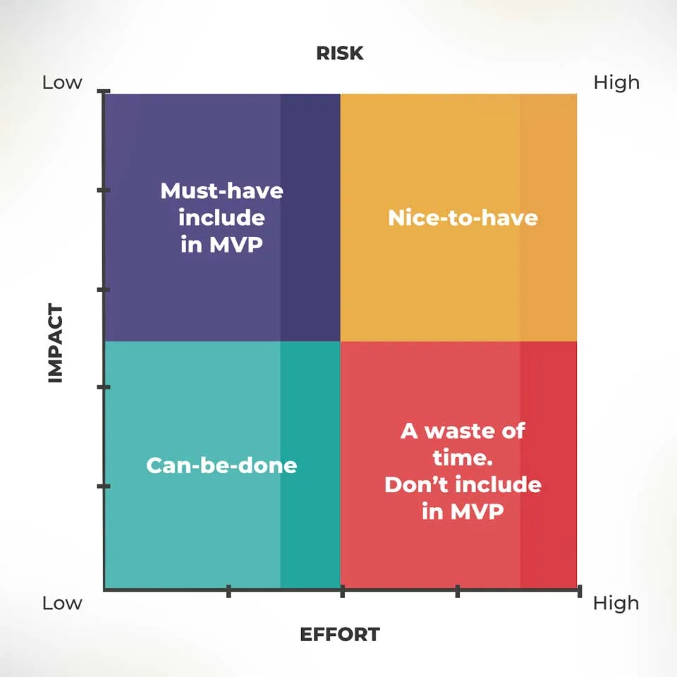
They could use a Four-Quadrant Chart to plot each project based on these two factors. Projects with high potential profitability and low technical complexity would be placed in one quadrant, representing low-risk, high-reward opportunities. Conversely, projects with low profitability and high technical complexity would fall into another quadrant, indicating high-risk, low-reward endeavors. This visualization helps the company prioritize projects based on their alignment with strategic objectives and resource allocation.
- Strengths:
- Visual representation: Provides a clear and intuitive visual representation of relationships between two variables.
- Simple interpretation: Easy to understand and interpret, making it suitable for communicating key insights to stakeholders.
- Quick analysis: Allows for quick identification of patterns or trends within the data.
- Limitations:
- Limited to two variables: Can only analyze relationships between two variables, which may not capture the full complexity of some situations.
- Subjectivity: Placement of data points within quadrants may be subjective, depending on how criteria are defined and measured.
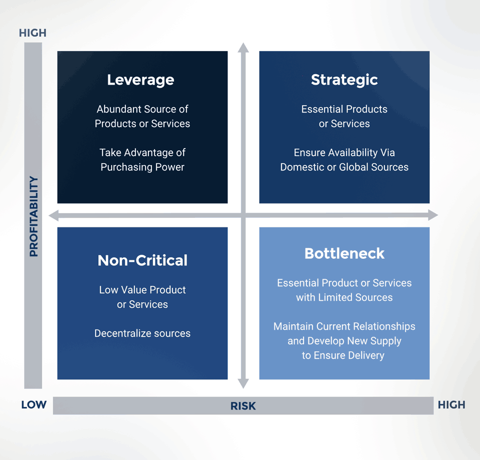
Business Matrix Example: Consider a manufacturing company seeking to select a supplier for a critical component. They could create a Business Matrix to evaluate several potential suppliers based on criteria such as quality, cost, reliability, and location. Each supplier would be assessed and scored against these criteria, with ratings ranging from poor to excellent. By comparing the scores for each supplier across all criteria, the company can identify the most suitable option. For instance, a supplier may excel in quality but have higher costs, while another may offer lower costs but with less reliability. The Business Matrix allows the company to make an informed decision based on a comprehensive evaluation of each supplier’s strengths and weaknesses.
- Strengths:
- Comprehensive evaluation: Allows for a comprehensive evaluation of alternatives based on multiple criteria or factors.
- Structured decision-making: Provides a structured framework for comparing and prioritizing alternatives objectively.
- Flexibility: Can accommodate a wide range of criteria and alternatives, making it suitable for complex decision-making scenarios.
- Limitations:
- Data collection: Requires detailed data collection and scoring for each criterion, which can be time-consuming and resource-intensive.
- Complexity: The matrix structure may become unwieldy with a large number of alternatives or criteria, leading to potential information overload.
- Subjectivity: Scoring criteria and assigning weights to criteria may involve subjective judgment, potentially leading to bias.
The choice between a Four-Quadrant Chart and a Business Matrix depends on factors such as the complexity of the decision-making task, the number of variables or criteria involved, and the preference for visual representation versus structured evaluation. Both tools have their strengths and limitations, and selecting the most appropriate one requires careful consideration of the specific requirements and objectives of the analysis.
Different types of diagrams
Diagrams are visual representations used to convey information, concepts, relationships, or processes in a structured and easily understandable manner. They come in various forms, each tailored to suit specific purposes and audiences.
Venn Diagram: Venn diagrams are used to show the relationships between different sets of items. They consist of overlapping circles, each representing a set, with the overlapping areas indicating items that belong to multiple sets. Venn diagrams are commonly used in mathematics, logic, statistics, and problem-solving scenarios to visualize the intersections and differences between various groups or categories. They help in analyzing similarities and differences between different elements or concepts.
Network Diagram: Network diagrams, also known as graph diagrams, illustrate the connections and relationships between various nodes or elements within a network. They are commonly used in computer science, telecommunications, project management, and systems engineering to depict the interactions between interconnected components. Network diagrams consist of nodes (representing entities or objects) and edges (representing the connections or relationships between them). These diagrams help in visualizing complex systems, identifying dependencies, and understanding the flow of information or resources within a network.
Alluvial Diagram: An Alluvial diagram is a type of flow diagram that represents changes over time or between different categories. It is particularly useful for visualizing the flow and relationships between multiple categorical variables across different stages or time periods. Alluvial diagrams use interconnected streams to show the transitions of items between categories. They are commonly used in data visualization to analyze complex datasets, such as migration patterns, product flows, or categorical data with multiple dimensions.
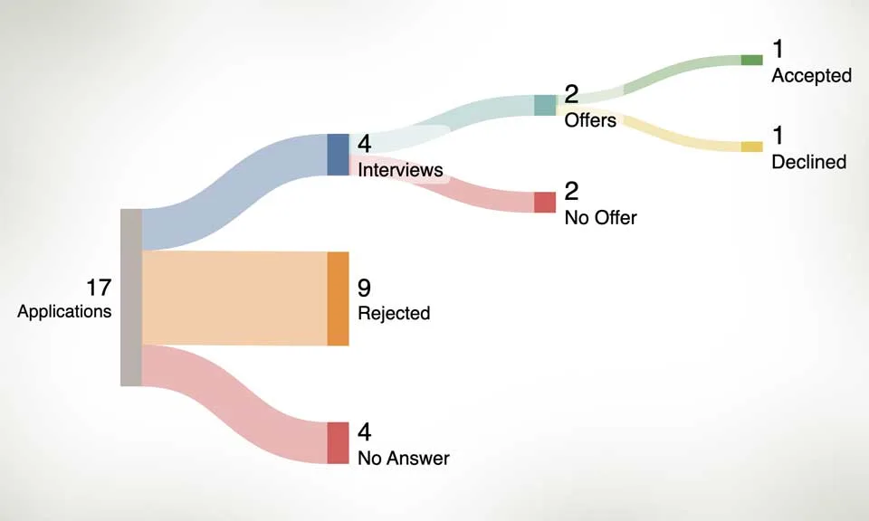
Sankey Diagram: A Sankey diagram is a type of flow diagram that visualizes the flow of energy, resources, or quantities through a system. It consists of nodes representing the sources and destinations of flows, connected by directed links representing the flow paths and their magnitudes. Sankey diagrams are effective in illustrating the distribution, transformation, and efficiency of resources or processes. They are widely used in engineering, environmental science, and business to analyze energy flows, material balances, and resource allocations.
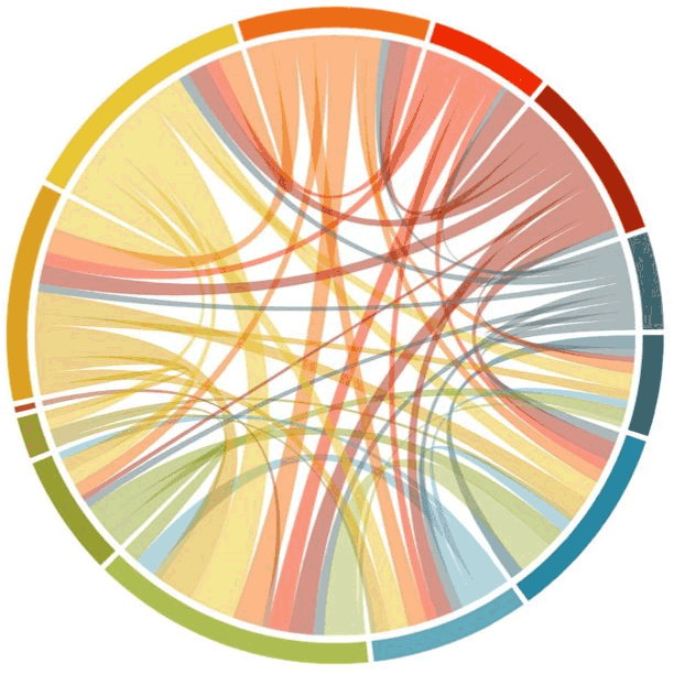
Chord Diagram: A Chord diagram is a circular graphical method used to visualize the relationships and connections between entities within a network or dataset. It consists of arcs that connect points around the circumference of a circle, with the width of each arc proportional to the strength or frequency of the connection between the corresponding entities. Chord diagrams are commonly used to represent pairwise relationships, such as trade flows between countries, connections between nodes in a social network, or co-occurrences of items in a dataset. They provide a concise and intuitive way to explore complex networks and identify patterns of interaction.
Defect Concentration Diagram: A Defect Concentration diagram, also known as a Pareto chart, is a specialized type of bar chart used to prioritize and visualize the frequency or impact of different types of defects, problems, or causes within a system or process. It consists of bars arranged in descending order of frequency or severity, with the cumulative percentage of occurrences represented by a line graph. Defect Concentration diagrams help in identifying the most significant contributors to overall issues or problems, allowing organizations to focus their efforts on addressing the most critical areas for improvement. They are commonly used in quality management, process improvement, and problem-solving methodologies such as Six Sigma.
Mind Map: A mind map is a hierarchical diagram used to visually organize information around a central concept or theme. It consists of a central idea or topic branching out into subtopics or related concepts, which further branch into more detailed or specific information. Mind maps are often used in brainstorming, note-taking, problem-solving, and decision-making processes to capture ideas, explore relationships, and stimulate creative thinking. They provide a structured yet flexible framework for organizing thoughts and concepts in a non-linear fashion.
Flowchart: Although a flowchart is typically referred to as a chart it can also be defined as a diagram representing a process or workflow.
The importance of Data Visualization for Business Professionals
In the contemporary data-driven landscape, where vast amounts of information are generated daily, data visualization plays a pivotal role in simplifying complexity.
Through visually engaging formats like graphs, charts, and diagrams, professionals can effectively convey intricate concepts, discern trends, identify anomalies, and unveil patterns within datasets. These visual representations not only aid comprehension but also expedite and enhance the accuracy of decision-making processes. Additionally, data visualization fosters collaboration among teams by providing a shared language through which stakeholders can interpret and analyze data, thus promoting alignment and consensus.
Effective visual communications start with a plan.
Building an effective chart or graph begins with a clear understanding of the data to be visualized and the intended message to convey.
Our process typically involves several key steps, starting with data collection and organization. Once the data is gathered, it’s essential to select the most appropriate type of chart or graph that aligns with the nature of the data and the insights sought. This decision considers factors such as the relationships between variables, the temporal aspects of the data, audience’s preferences and ease of use by the viewer. Next, the chosen chart or graph is designed and constructed with the goal of ensuring clarity, accuracy, and visual appeal. Labels, titles, and axis descriptions are added to provide context and aid interpretation. Throughout the process, attention to detail is key to ensuring the accuracy and integrity of the visual representation. Finally, the completed chart or graph is reviewed by the team and refined as necessary to optimize its effectiveness in communicating the desired information clearly and concisely to stakeholders or decision-makers.