• Skip to primary navigation
  • Skip to main content
Velocity Ascent

Velocity Ascent

Looking toward tomorrow today

  • Research
  • Design
  • Development
  • Strategy
  • About
    • Home
    • Contact Us
    • Services
  • Show Search
Hide Search

Marketing

Generative AI: Revolutionizing Video & Image Production

Joe Skopek · August 30, 2024 ·

Video & Imagery Production is undergoing a seismic shift, thanks to the arrival of advanced AI technologies like Midjourney and Runway.

The workflow of video and image production is undergoing a seismic shift, thanks to the merging of advanced AI technologies like Midjourney v6.1 and Runway Gen-3. This powerful combination is more than just a technical marvel; it’s a transformative tool for marketing agencies, revolutionizing the way they approach video content creation.

Accelerating Production with AI Synergy

For marketing agencies, the need to produce high-quality video content quickly and efficiently is paramount. The integration of Midjourney v6.1 and Runway Gen-3 offers a solution by streamlining the pre-production process. These tools allow creators to visualize and animate storyboards at an unprecedented pace, reducing the time it takes to move from concept to final product.

This speed and flexibility mean that agencies can handle more projects simultaneously, increasing their output without sacrificing quality. By automating time-consuming tasks, AI enables teams to focus on refining creative ideas rather than getting bogged down in the technical aspects of production.

Our Experimentation:

We conducted several dozen tests and reviewed numerous articles and papers online to evaluate the integration of Generative AI in early-stage storyboard development for videos and its impact on agency workflows. The results were eye-opening.

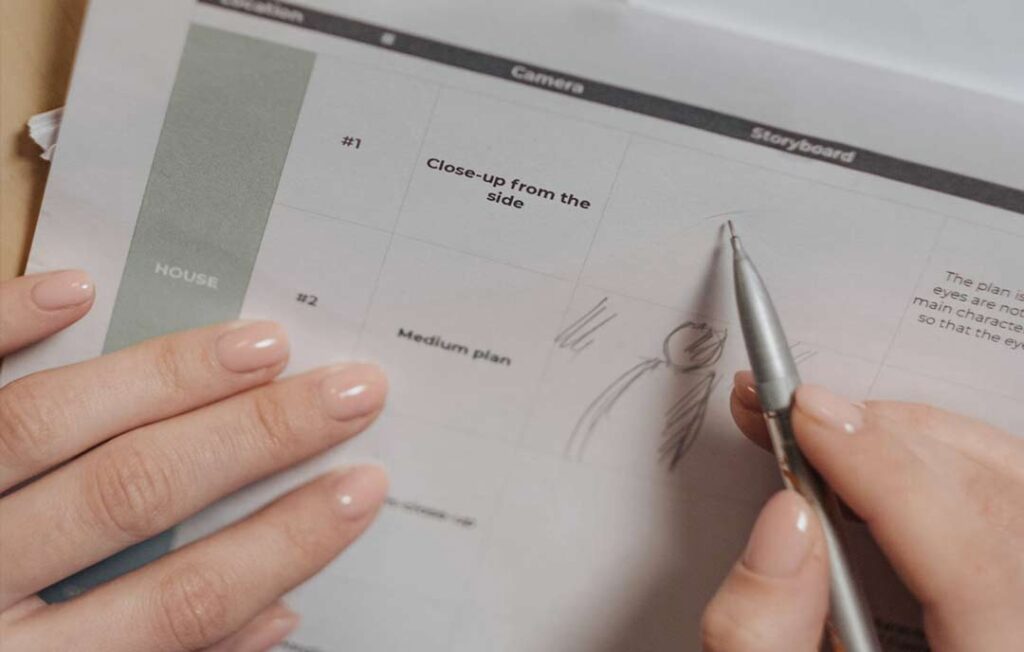
Source Image Creation:

For this experiment, the creative brief required the following: the image must include a group of friendly seniors smiling around a smartphone at a picnic table in the summer, during golden hour. The first attempts were promising, and after a few subtle adjustments to the prompt, we began to achieve ‘realistic’ results close to stock photography.

Early experiment generating a group of Seniors.

A good start, but the image looked a bit too ‘Princess Bride,’ with colors that were far too saturated. While it’s possible to use the SREF in Midjourney and a color palette from Adobe Color to color grade your Midjourney imagery, we opted for a more hands-on approach. We created a custom color range tailored to our target, resulting in improved color balance and a higher degree of ‘believability.’ Much of the effort went into refining the output.

Array of images generated during refinement.

Our second goal was to enhance the appearance of the seniors. Initially, they appeared, forgive the ageism, too old for our demographic requirements. Finally, we adjusted the prompt to eliminate unwanted artifacts, such as seniors holding two phones instead of one and glasses melting into the table.

Final image chosen for use in video storyboard.

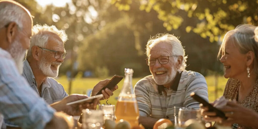
The final image did more than achieve the creative brief baseline requirements – it created a “feeling”. You can almost feel the warmth of a late summer day and the joy of the gathered Seniors. With the image and prompts finalized our next step was to move over to Video Gen.

Video Generation:

Since we would just be using AI Video Generation as a storyboard and not for broadcast we ran the first series as “vanilla prompts”. This allowed us to quickly generate action that could be placed in the storyboard sample with lots of room for feedback and adjustment.

Early stage test of AI Generative Video

Our initial tests yielded the expected otherworldly creations; the video starts off normally but quickly spirals into a surreal, science fiction fever-dream with all but one of the Seniors sliding into oblivion. Applying a revised prompt set and rethinking the scene resulted in a new direction more in line with the requirements.

Late stage test of AI Generative Video

The results are nothing short of fascinating, the motion is smooth and the Seniors appear to be in a natural setting acting normally. There are still some anomalies that are fine-tuned out of the finished video. For example in the sample video above you will notice on the left side of the scene the smartphone morphs into the pint glass. A few more edits to the prompt will resolve this.

Given the time and resources typically needed for custom video production or extensive research across stock agencies, the speed of this process is remarkably faster. Even more exciting is that we are only at the dawn of this technology.

Cost Reduction and Enhanced Creative Output

The financial benefits of this AI-driven approach are significant. By reducing the time and resources required for video production, agencies can lower costs for their clients while delivering even more compelling content. This efficiency opens up opportunities for smaller businesses to access high-quality video production, which was previously only within reach of larger companies with bigger budgets.

Moreover, the enhanced creative capabilities of these AI tools allow for rapid prototyping and experimentation. Agencies can quickly test and iterate on ideas, ensuring that the final product aligns perfectly with the client’s vision. This ability to fine-tune creative concepts on the fly is a game-changer for marketing campaigns, where the margin for error is often slim.

While AI can automate certain aspects of video creation, it lacks the nuanced understanding of brand voice, audience preferences, and emotional resonance that only human creators can bring.

The Human Element: Essential and Irreplaceable

Despite the incredible advancements in AI technology, the human element remains crucial in the production process. While AI can automate certain aspects of video creation, it lacks the nuanced understanding of brand voice, audience preferences, and emotional resonance that only human creators can bring.

The role of the human in this AI-driven workflow is to guide and shape the creative direction, ensuring that the content not only meets technical standards but also connects with viewers on a deeper level. AI tools serve as powerful assistants, augmenting human creativity but never replacing it. This collaboration between human ingenuity and machine efficiency is where the true potential of AI in video production lies.

Transforming the Advertising and Entertainment Industries

The impact of this AI merging extends beyond marketing agencies to the broader advertising and entertainment industries. The ability to rapidly prototype ideas and create high-quality visual content democratizes the production process, making it accessible to a wider range of creators, from seasoned professionals to enthusiastic hobbyists.

As this technology continues to evolve, we’re likely to see a shift in how visual media is consumed and interacted with. The lines between imagination and realization are becoming increasingly blurred, allowing for more immersive and personalized storytelling experiences.

Impact on Traditional Video Production:

AI tools are transforming video production by automating many aspects of the process, such as editing, special effects, and even scriptwriting. This automation can greatly speed up production timelines and reduce costs, enabling agencies to produce more content with fewer resources. For smaller teams or independent creators, AI provides access to high-quality production tools that were once out of reach.

However, this increased efficiency could lead to a reduction in the demand for certain roles, such as video editors, animators, and even directors. As AI becomes more sophisticated, the need for manual intervention in repetitive or technical tasks will decrease, potentially leading to job losses in these areas.

Impact on Stock Agencies:

AI-generated content also poses a challenge to traditional stock agencies. With AI tools capable of creating high-quality images, videos, and even audio, the reliance on stock libraries may diminish. Creators can now generate custom content tailored to their specific needs without having to sift through existing libraries. This shift could reduce demand for traditional stock footage and images, impacting the revenue streams of stock agencies.

Potential Job Losses:

While AI has the potential to displace certain jobs, it’s important to recognize that it also creates new opportunities. Jobs focused on AI tool development, data analysis, and AI integration into creative processes will likely grow. Additionally, roles that require a high degree of creativity, strategic thinking, and emotional intelligence—skills that AI currently cannot replicate—will remain essential.

The key for professionals in the industry will be to adapt to these changes by learning to work alongside AI, using it as a tool to enhance their capabilities rather than viewing it as a replacement. Those who can harness the power of AI to augment their creativity and productivity will find new opportunities in the evolving landscape of video production and stock media.

The importance of the human touch in this process cannot be overstated.

The Future of Storytelling

The future of video production is here, and it’s powered by AI. For marketing agencies, embracing this technology means not only staying competitive but also pushing the boundaries of what’s possible in creative content creation.

However, the importance of the human touch in this process cannot be overstated. As we move forward into this new era of AI-driven production, the collaboration between human creativity and AI efficiency will be the key to unlocking new levels of innovation and storytelling.

Data Visualization for Business Professionals

velocityascent · March 12, 2024 ·

If all graphs are a type of chart, and all charts are not graphs – what are diagrams?

Graphs, charts, and diagrams serve as powerful tools that offer clarity, enhance communication, and drive informed decision-making. By transforming complex datasets and ideas into visually compelling representations, business professionals gain insights, spot trends, and collaborate more effectively. From facilitating understanding to identifying opportunities and risks, data visualization plays a vital role in empowering organizations to thrive in a competitive environment.

Charts, encompassing bar charts, pie charts, and scatter plots, among others, excel in presenting data comparisons, distributions, and compositions, respectively. They offer a concise snapshot of information, making them ideal for conveying trends and relationships in a straightforward manner. Graphs, including line graphs, area graphs, and histograms, specialize in showcasing data trends and distributions

Charles Minard’s 1869 Sankey chart showing the number of men in Napoleon’s 1812 Russian campaign army, their movements, as well as the temperature they encountered on the return path.

over time or across variables, aiding in trend analysis and pattern recognition. Diagrams, such as flowcharts, network diagrams, and organizational charts, are instrumental in illustrating processes, hierarchies, and relationships, facilitating understanding and decision-making in complex systems.

Different types of graphs

The concept of graphs, as in graphical representations of data, has been around for centuries, with various scholars and scientists contributing to its development over time. One notable figure in the history of graphs is William Playfair, a Scottish engineer and economist, who is often credited with inventing several types of graphs in the late 18th century. Playfair created the line graph, bar chart, and pie chart, which are fundamental components of modern data visualization.

Playfair’s trade-balance time-series chart, published in his Commercial and Political Atlas, 1786

However, it’s important to note that graphical representations of data have been used in different forms throughout history by different civilizations for various purposes, such as illustrating statistical information, depicting geographical features, and conveying mathematical concepts. So, while Playfair made significant contributions to the development of modern graphs, the origins of graphical representations of data can be traced back much further.

Line Graphs: Utilized to illustrate fluctuating data trends over specified timeframes, such as temperature variations across different dates, line graphs provide a succinct depiction of relational data dynamics.

Bar Graphs: With their simple yet impactful presentation, bar graphs facilitate easy comparison of numerical values, making them indispensable for analyzing inventories, group sizes, and financial forecasts. Widely employed by marketing firms, they effectively showcase ratings and survey responses.

Pictographs: Employing images or symbols in lieu of bars, pictographs offer a visually engaging means of representing data, ideal for conveying information in formats like infographics. For instance, depicting book sales over several months using book icons adds an intuitive dimension to the data.

Histograms: Ideal for illustrating the distribution of numeric data across categories, histograms provide valuable insights into statistical patterns. Whether portraying age demographics within a population or other categorical distributions, histograms offer a comprehensive overview of data distribution.

Area Graphs: Capturing changes in one or multiple quantities over time, area graphs are instrumental in identifying trends and patterns. By incorporating color-coded segments, they elucidate how diverse quantities contribute to an overarching trend, aiding businesses in strategic decision-making processes.

Scatter Plots: Offering a visual representation of the relationship between two variables, scatter plots provide invaluable insights into correlations. Whether analyzing the connection between height and weight or other paired variables, scatter plots reveal patterns that inform data-driven strategies.

Different types of charts

In today’s data-driven world, the ability to effectively communicate complex information is key. Charts serve as powerful tools for transforming raw data into actionable insights, providing clarity and context in a visually appealing manner. Pioneers John von Neumann, Herman H. Goldstine, and Arthur W. Burks laid the groundwork for electronic computing back in 1947 with their seminal work, “Preliminary Discussion of the Logical Design of an Electronic Computing Instrument.” They created the first computer flow charts to simplify and streamline the understanding of intricate data sets.

1947 – John Von Neumann created the first theoretical discussion of programming through use of ‘flow diagram’ (which eventually became flow chart and finally, flowchart) as a logically complete and precise notation for expressing a mathematical problem, and eventually formed the basis for all computer programming.

From bar graphs to scatter plots, these visual aids have become indispensable assets in the modern business landscape, facilitating informed decision-making and driving success.

Flowcharts: Essential for mapping out processes from inception to conclusion, flowcharts elucidate decision points and possible pathways within complex workflows. A flowchart can also be considered as a diagram that represents a process or workflow through a series of shapes connected by arrows. It is widely used in business, engineering, and computer programming to illustrate the steps involved in completing a task or achieving a goal. Flowcharts typically start with a starting point (usually represented by an oval), followed by various actions or decisions represented by rectangles or diamonds, and ending with an outcome or final step. They provide a visual roadmap for understanding the sequence of actions and decision points within a process.

Pie Charts: Efficiently conveying proportions within a whole, pie charts are instrumental in visualizing segments of data. Whether delineating demographic segments or budget allocations, pie charts offer a succinct overview in business presentations. A pie chart is typically a circular statistical graphic divided into slices to illustrate numerical proportions. Each slice represents a proportionate part of the whole, with the size of each slice corresponding to the relative magnitude of the data it represents. They provide a quick and intuitive way to understand how different components contribute to a total or overall value.

Gantt Charts: Invaluable for project management, Gantt charts delineate project schedules, providing a comprehensive overview of tasks and timelines. By visually tracking progress and milestones, they ensure seamless project execution.

Waterfall Charts: Designed to showcase variances over time, waterfall charts elucidate the impact of successive changes on an initial value. Whether analyzing financial statements or profit and loss trends, they provide a nuanced understanding of evolving data sets.

Gauge Charts: Offering a visual representation akin to a dial, gauge charts pinpoint specific data points within predefined ranges. From illustrating performance metrics to tracking revenue goals, gauge charts provide at-a-glance insights into key business parameters.

Funnel Charts: With their distinctive shape, funnel charts illustrate the progression of values through sequential stages. Whether tracking sales pipelines or website traffic, funnel charts offer a dynamic portrayal of evolving data trends.

Bullet Charts: Tailored to measure performance against predefined targets, bullet charts are invaluable for assessing progress towards key objectives. Whether tracking profits or expenses, they provide a comprehensive overview of key performance indicators (KPIs) within a single visual framework.

Four-Quadrant Chart: A Four-Quadrant Chart, also known as a Quadrant Analysis or a Cartesian Chart, is a graphical tool used to categorize data into four quadrants based on two independent variables. The chart typically has two axes (horizontal and vertical) representing these variables. Each axis divides the chart into two halves, creating four quadrants. The data points are plotted on the chart based on their values for the two variables, with each quadrant representing a different combination of high and low values for the variables. Four-Quadrant Charts are commonly used in business, management, and decision-making to analyze and prioritize strategies, projects, or products based on criteria such as profitability, market growth, risk, or performance.

Business Matrix: A Business Matrix, also known as a Decision Matrix or Grid Analysis, is a structured decision-making tool used to evaluate and prioritize alternatives based on multiple criteria or factors. It consists of a matrix with criteria listed along the rows and alternatives listed along the columns. Each cell in the matrix represents the intersection of a criterion and an alternative, where scores or ratings are assigned to evaluate the performance of each alternative against each criterion. Business Matrices help in systematically comparing and selecting the best option among competing alternatives, considering various factors such as cost, quality, time, and feasibility. They are widely used in project management, product development, supplier selection, and strategic planning to support decision-making processes and enhance transparency in evaluations.

What is the difference between The Four-Quadrant Chart and a Business Matrix?

The Four-Quadrant Chart and a Business Matrix are both tools that use matrices and can aid decision-making, they have distinct applications and structures. The Four-Quadrant Chart focuses on visualizing relationships between variables, while the Business Matrix is geared towards evaluating and prioritizing alternatives based on predefined criteria.

The Four-Quadrant Chart is primarily used to categorize data into four quadrants based on two independent variables. It helps visualize relationships between variables and identify patterns or trends within the data. This type of chart is often used in business to analyze strategies, products, or projects based on criteria like risk and reward, cost and benefit, or effort and impact.

On the other hand, the Business Matrix, also known as a Decision Matrix or Grid Analysis, is a tool used to evaluate and prioritize alternatives based on multiple criteria or factors. It involves creating a matrix where alternatives are listed in rows and criteria are listed in columns. Scores or ratings are then assigned to each alternative based on its performance against each criterion. The Business Matrix facilitates systematic comparison and selection of the best option among competing alternatives, considering various factors such as cost, quality, and feasibility.

Let’s look at two real-world examples of the Four-Quadrant Chart and the Business Matrix.

Four-Quadrant Chart Example: Imagine a software development company evaluating its various projects based on their potential profitability and technical complexity.

They could use a Four-Quadrant Chart to plot each project based on these two factors. Projects with high potential profitability and low technical complexity would be placed in one quadrant, representing low-risk, high-reward opportunities. Conversely, projects with low profitability and high technical complexity would fall into another quadrant, indicating high-risk, low-reward endeavors. This visualization helps the company prioritize projects based on their alignment with strategic objectives and resource allocation.

  • Strengths:
    • Visual representation: Provides a clear and intuitive visual representation of relationships between two variables.
    • Simple interpretation: Easy to understand and interpret, making it suitable for communicating key insights to stakeholders.
    • Quick analysis: Allows for quick identification of patterns or trends within the data.
  • Limitations:
    • Limited to two variables: Can only analyze relationships between two variables, which may not capture the full complexity of some situations.
    • Subjectivity: Placement of data points within quadrants may be subjective, depending on how criteria are defined and measured.

Business Matrix Example: Consider a manufacturing company seeking to select a supplier for a critical component. They could create a Business Matrix to evaluate several potential suppliers based on criteria such as quality, cost, reliability, and location. Each supplier would be assessed and scored against these criteria, with ratings ranging from poor to excellent. By comparing the scores for each supplier across all criteria, the company can identify the most suitable option. For instance, a supplier may excel in quality but have higher costs, while another may offer lower costs but with less reliability. The Business Matrix allows the company to make an informed decision based on a comprehensive evaluation of each supplier’s strengths and weaknesses.

  • Strengths:
    • Comprehensive evaluation: Allows for a comprehensive evaluation of alternatives based on multiple criteria or factors.
    • Structured decision-making: Provides a structured framework for comparing and prioritizing alternatives objectively.
    • Flexibility: Can accommodate a wide range of criteria and alternatives, making it suitable for complex decision-making scenarios.
  • Limitations:
    • Data collection: Requires detailed data collection and scoring for each criterion, which can be time-consuming and resource-intensive.
    • Complexity: The matrix structure may become unwieldy with a large number of alternatives or criteria, leading to potential information overload.
    • Subjectivity: Scoring criteria and assigning weights to criteria may involve subjective judgment, potentially leading to bias.

The choice between a Four-Quadrant Chart and a Business Matrix depends on factors such as the complexity of the decision-making task, the number of variables or criteria involved, and the preference for visual representation versus structured evaluation. Both tools have their strengths and limitations, and selecting the most appropriate one requires careful consideration of the specific requirements and objectives of the analysis.

Chord diagrams are commonly used to represent pairwise relationships, such as trade flows between countries, connections between nodes in a social network, or co-occurrences of items in a dataset.

Different types of diagrams

Diagrams are visual representations used to convey information, concepts, relationships, or processes in a structured and easily understandable manner. They come in various forms, each tailored to suit specific purposes and audiences.

Venn Diagram: Venn diagrams are used to show the relationships between different sets of items. They consist of overlapping circles, each representing a set, with the overlapping areas indicating items that belong to multiple sets. Venn diagrams are commonly used in mathematics, logic, statistics, and problem-solving scenarios to visualize the intersections and differences between various groups or categories. They help in analyzing similarities and differences between different elements or concepts.

Network Diagram: Network diagrams, also known as graph diagrams, illustrate the connections and relationships between various nodes or elements within a network. They are commonly used in computer science, telecommunications, project management, and systems engineering to depict the interactions between interconnected components. Network diagrams consist of nodes (representing entities or objects) and edges (representing the connections or relationships between them). These diagrams help in visualizing complex systems, identifying dependencies, and understanding the flow of information or resources within a network.

Alluvial Diagram: An Alluvial diagram is a type of flow diagram that represents changes over time or between different categories. It is particularly useful for visualizing the flow and relationships between multiple categorical variables across different stages or time periods. Alluvial diagrams use interconnected streams to show the transitions of items between categories. They are commonly used in data visualization to analyze complex datasets, such as migration patterns, product flows, or categorical data with multiple dimensions.

Example of a Sankey diagram used for hiring.

Sankey Diagram: A Sankey diagram is a type of flow diagram that visualizes the flow of energy, resources, or quantities through a system. It consists of nodes representing the sources and destinations of flows, connected by directed links representing the flow paths and their magnitudes. Sankey diagrams are effective in illustrating the distribution, transformation, and efficiency of resources or processes. They are widely used in engineering, environmental science, and business to analyze energy flows, material balances, and resource allocations.

Chord Diagram: A Chord diagram is a circular graphical method used to visualize the relationships and connections between entities within a network or dataset. It consists of arcs that connect points around the circumference of a circle, with the width of each arc proportional to the strength or frequency of the connection between the corresponding entities. Chord diagrams are commonly used to represent pairwise relationships, such as trade flows between countries, connections between nodes in a social network, or co-occurrences of items in a dataset. They provide a concise and intuitive way to explore complex networks and identify patterns of interaction.

Defect Concentration Diagram: A Defect Concentration diagram, also known as a Pareto chart, is a specialized type of bar chart used to prioritize and visualize the frequency or impact of different types of defects, problems, or causes within a system or process. It consists of bars arranged in descending order of frequency or severity, with the cumulative percentage of occurrences represented by a line graph. Defect Concentration diagrams help in identifying the most significant contributors to overall issues or problems, allowing organizations to focus their efforts on addressing the most critical areas for improvement. They are commonly used in quality management, process improvement, and problem-solving methodologies such as Six Sigma.

Mind Map: A mind map is a hierarchical diagram used to visually organize information around a central concept or theme. It consists of a central idea or topic branching out into subtopics or related concepts, which further branch into more detailed or specific information. Mind maps are often used in brainstorming, note-taking, problem-solving, and decision-making processes to capture ideas, explore relationships, and stimulate creative thinking. They provide a structured yet flexible framework for organizing thoughts and concepts in a non-linear fashion.

Flowchart: Although a flowchart is typically referred to as a chart it can also be defined as a diagram representing a process or workflow.

The importance of Data Visualization for Business Professionals

In the contemporary data-driven landscape, where vast amounts of information are generated daily, data visualization plays a pivotal role in simplifying complexity.

Through visually engaging formats like graphs, charts, and diagrams, professionals can effectively convey intricate concepts, discern trends, identify anomalies, and unveil patterns within datasets. These visual representations not only aid comprehension but also expedite and enhance the accuracy of decision-making processes. Additionally, data visualization fosters collaboration among teams by providing a shared language through which stakeholders can interpret and analyze data, thus promoting alignment and consensus.

Effective visual communications start with a plan.

Building an effective chart or graph begins with a clear understanding of the data to be visualized and the intended message to convey.

Our process typically involves several key steps, starting with data collection and organization. Once the data is gathered, it’s essential to select the most appropriate type of chart or graph that aligns with the nature of the data and the insights sought. This decision considers factors such as the relationships between variables, the temporal aspects of the data, audience’s preferences and ease of use by the viewer. Next, the chosen chart or graph is designed and constructed with the goal of ensuring clarity, accuracy, and visual appeal. Labels, titles, and axis descriptions are added to provide context and aid interpretation. Throughout the process, attention to detail is key to ensuring the accuracy and integrity of the visual representation. Finally, the completed chart or graph is reviewed by the team and refined as necessary to optimize its effectiveness in communicating the desired information clearly and concisely to stakeholders or decision-makers.

Lights, Camera, Branding: The Power of Video Narratives

velocityascent · February 6, 2024 ·

Video narratives allow you to tell the exact story you want to convey to your audience.

The power of video to raise awareness and build a brand cannot be understated. A well planned strategic long-form video can educate the viewer within several minutes, or peak their interest with a short form series of 15 second clips.

Launching a new brand, creating a marketing campaign or seeking to rejuvenate an existing product line all benefit from a targeted video narrative. In this blog post, we’ll explore the art of using video but also the science of analytics to learn about the audience and respond.


The remarkable power of video
to sell a new idea.

Video has a unique ability to engage, inspire, and emotionally connect with the viewer especially with a new or complex concept. Video can quickly educate the viewer on updated technical aspects or unique features. Combining visuals, audio, and narrative to create a compelling and memorable experience about your service, product or organization. With a strategic approach, video can be a powerful tool to convey your brand’s identity and values as well.

Take a moment to watch the video below…

TCP – Climate Safe

This video was produced for The Copernicus Project as a preliminary proof-of-concept narrative of an IoT local climate security solution. Created for an audience of investors and partners it is designed to replicate what the real world experience might look like in the field.

The power of the imagery and music set the tone of technology and cutting-edge innovation. The animations convey a clear message of local conditions and the potential for monitoring and alerting to strong weather events.

The absence of a voice-over reinforces the meditative quality of the story while the music provides a steady beat for the changing imagery. For the target audience (of early investors and partners) this video functions as a defacto “Elevator Pitch” – all in less than 2 minutes.

Three samples of Video Narratives for new ideas:

1. Craft a Compelling Origin Story:

Every brand has an origin story. Use video to narrate how your brand came into existence. Share the passion, inspiration, and vision that led to its creation. A well-crafted origin story can resonate with viewers and establish an emotional connection.

2. Visualize Your Brand’s Values:

Video allows you to showcase your brand’s core values and principles in action. Whether it’s environmental sustainability, social responsibility, or innovation, use visuals to reinforce your commitment to these values.

3. Demonstrate Unique Features and Benefits:

If your brand offers a unique product or service, demonstrate its features and benefits through video. Show how it solves a problem or enhances the lives of your customers.

Re-establishing Existing Brands

The “Think Different” campaign, launched in 1997, was a pivotal moment for Apple. At that time, Apple was in a challenging position, facing competition from Microsoft and struggling with its market share. The campaign, including the “Here’s to the crazy ones” ad, was designed to reposition Apple as an innovative and forward-thinking brand.

Apple – Here’s to the crazy ones / Think Different

Internally, the ad had a profound effect on Apple’s employees and staff. At that time, the company was going through internal challenges, and the ad served as a rallying cry to reignite a sense of purpose and pride among Apple employees.

The “Think Different” campaign, including the “Here’s to the crazy ones” ad, remains one of the most iconic and memorable marketing efforts in the history of advertising and played a pivotal role in Apple’s resurgence as a brand associated with innovation and creativity.

How to Re-establish an Existing Brand with video:

1. Reimagine Your Brand Identity:

Over time, brands may evolve or reposition themselves. Video narratives provide a dynamic platform to reintroduce your brand to your audience. Showcase the transformation, explain the reasons behind it, and reignite interest.

2. Humanize Your Brand:

People connect with people, not just products or logos. Use video to put a human face on your brand. Feature employees, share their stories, and highlight the human element behind your brand’s success.

3. Address Challenges and Solutions:

If your brand has faced challenges or controversies, address them openly through video narratives. Transparency and authenticity can help rebuild trust and loyalty. Share the steps you’ve taken to overcome obstacles and improve.

Case Study in Video Brand Collage

A Video Brand Collage is a visual and audio representation that combines various video clips, images, graphics, and audio elements to create a comprehensive and engaging portrayal of a brand’s identity, values, products, or services. It serves as a dynamic and multi-dimensional way to showcase a brand’s story, personality, and offerings to its target audience.

Video Brand Collages are commonly used in digital marketing campaigns, including social media, websites, email marketing, and online advertisements. They provide a visually appealing way to communicate with audiences across various platforms.

Colt – Building a stronger America

This video brand collage was developed by Velocity Ascent to support the pre-launch of Colt’ Firearms’s Apparel line for men. The video is designed to evoke the rich colorful history of Colt and the world where it established its historical position.

Lights, camera, branding—it’s time to let your brand’s story shine on the screen – whatever form factor that might be; smartphone, handheld, laptop, desktop, TV.

The authenticity of the timeless brand elements and apparel, combined with a contemporary cinematic musical score, immediately establishes the tone and style with team members and the retail apparel community. It also provides a platform for displaying Colt’s commitment to a high quality product.

One Recipe for Effective Video Narratives:

Storytelling: Craft a compelling narrative that resonates with your target audience. Use storytelling techniques to create an emotional connection and leave a lasting impression.

Visual Excellence: Invest in high-quality visuals and production values. Engaging cinematography, graphics, and animation can elevate your brand’s image.

Authenticity and Transparency: Be authentic in your storytelling. Audiences appreciate transparency and honesty. Address both successes and challenges with a healthy reality-check.

Distribution Strategy: Develop a strategic plan for sharing your video narratives. Utilize social media, your website, email marketing, and other channels to maximize reach.

This is just one option for creating an Effective Video Narrative there are many more – each one tailored to the use and audience.

Within the myriad of values video provides as a medium, most valuable is the ability to totally control the message and meaning. Crafting a linear storyline through the brand, the experience and the unique attributes of the product or service.

Conclusion: The Future of Branding Is Visual Video

Attention spans are shrinking, and competition is fierce, video narratives have emerged as a formidable tool for brand storytelling. They can transcend language barriers, evoke a range of emotions, and create lasting impressions with your audience. By harnessing the power of video, we can collaborate and tell your brand’s story in a way that captures hearts, minds, and market share.

Shameless Plug:

The small, robust, and nimble team at Velocity Ascent excell at crafting and defining narrative videos. Guided by an unwavering commitment to best practices in storytelling, combined with a deep understanding of user needs, societal trends and preferences, forms the bedrock of exceptional design and production outcomes. Our goal is to craft stories that activate the viewer.

Want to learn more – get in touch!

The Slide Deck is dead – long live the Slide Deck!

velocityascent · January 7, 2024 ·

Bid farewell to outdated conventions and embrace the era of dynamic, engaging and impactful slide deck production.

Out with the old, in with the new: the traditional approach to slide deck creation is undergoing a profound transformation. As the demands of modern business evolve, so too must our methods of communication and presentation. Gone are the days of static, uninspiring slides littered with bullet points and blocks of twelve point text. Todays innovative tools and techniques empower us to captivate audiences like never before.

This Look Book video presents a variety of contemporary layouts for a slide.

As professionals, we are constantly challenged to elevate our content, captivate our audience, and deliver impactful messages. Amidst this evolution, understanding the nuances of slide deck production becomes crucial. Let’s delve into the realm of modern slide deck creation, exploring the diverse tools, debunking clichés, and uncovering industry best practices.

Debunking Clichés: Beyond Bullet Points and Clip Art

Gone are the days of monotonous slide decks inundated with bullet points and clichéd clip art. Today, effective communication demands creativity and authenticity. Engage your audience by incorporating visually striking graphics, compelling imagery, and concise text. Embrace storytelling techniques to craft narratives that resonate with your viewers. Break free from the shackles of tradition, and dare to experiment with unconventional layouts and multimedia elements. Remember, the goal is not merely to convey information but to leave a lasting impression that sparks dialogue and action.

Industry Best Practices: Crafting Compelling Narratives

In the realm of slide deck production, adhering to industry best practices can elevate your presentations from mundane to memorable. Begin with a clear outline, ensuring a logical flow of ideas throughout your slides. Maintain consistency in design elements such as color schemes, fonts, and imagery to enhance visual coherence. Prioritize brevity and clarity, avoiding information overload that can overwhelm your audience. Leverage the power of visuals to reinforce key points and evoke emotive responses. Lastly, rehearse your delivery to cultivate confidence and ensure seamless execution on the day of the presentation.

Leading Platforms: Navigating the Landscape

Among the leading platforms, Google Slides, PowerPoint, and Keynote stand out as stalwarts in the realm of slide deck production. Google Slides, with its collaborative prowess and cloud-based functionality, facilitates real-time collaboration and seamless sharing. PowerPoint, a longstanding favorite, offers unparalleled customization options and integrations with other Microsoft Office applications.

User comparison; Keynote, Powerpoint, Google slides and Libre Office – 2019-2024

Keynote, tailored for the Mac ecosystem, impresses with its intuitive interface and stunning templates. For those embracing open-source solutions, platforms like LibreOffice Impress offer robust functionalities without the constraints of proprietary software. Choosing the right tool aligns with your objectives and enhances the efficiency of your presentation endeavors.

Conclusion:

In conclusion, the slide deck may have evolved, but its relevance remains steadfast in the realm of professional communication. By harnessing the array of tools available, debunking clichés, embracing industry best practices, and leveraging leading platforms, savvy business professionals can elevate their presentations to new heights. Let us bid farewell to outdated conventions and embrace the era of dynamic and impactful slide deck production. Long live the slide deck!

Shameless Plug:

We believe that the small, robust, and nimble team at Velocity Ascent exemplifies the synergy of the new era. Guided by an unwavering commitment to best practices, combined with a deep understanding of user needs and preferences, forms our bedrock of exceptional design and production outcomes. As we begin to harness the power of AI to streamline processes and push creative boundaries, we hope to demonstrate that the future belongs to those who can navigate the delicate interplay between technology and human skill. The positive results achieved stand as a testament to the limitless possibilities that arise when human expertise and AI tools converge to craft experiences that delight and inspire.

Want to learn more – get in touch!

Velocity Ascent

© 2025 Velocity Ascent · Privacy · Terms · YouTube · Log in